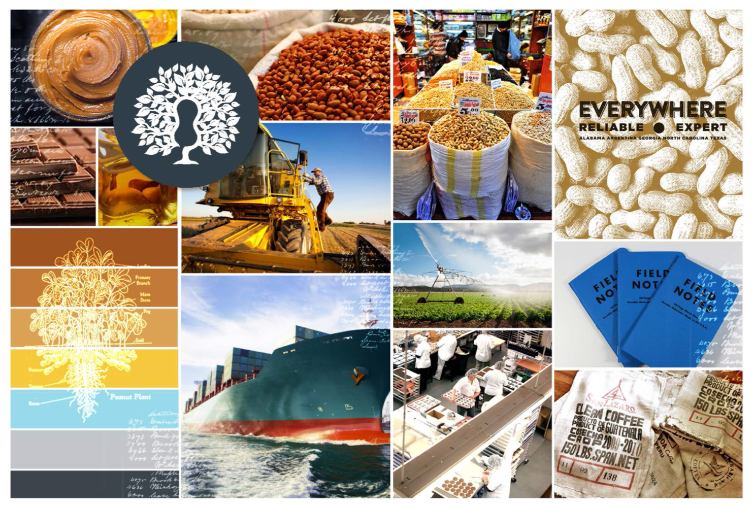
A subsidiary of ADM, Golden Peanut is the world’s largest producer and distributor of peanuts. The brand has a strong history and even sets the market price for the product globally. As the company expanded operations to include tree nuts as well, there was an opportunity to update and reinvigorate the brand voice, look and feel. Golden Peanut would become Golden Peanut and Tree Nut. This required a balanced approach that would include the company’s rich history, family farm growers, as well as sophisticated global manufacturers like Hershey and Nestle.
The brand team wanted the new identity to feel like it had been here forever, while also feeling fresh and modern. Research began with depth interviews of customers, growers and internal sales and marketing people. Our goal was to discover what attributes were at the core of the story. We wanted to understand what had to be included and what could be left behind. We facilitated senior management vision session and set the course for where the brand was going in the global market.
Truly, with little competition at scale, major buyers would need to buy from Golden just to fulfill their need for the product, in everything from peanut butter to candy bars, to ant poison and peanut oil. On the other hand, the local south Georgia or African farmer could sell their crop to the competition. Supply became the driver as we went down south to dig in to what would motivate these tradition oriented producers.
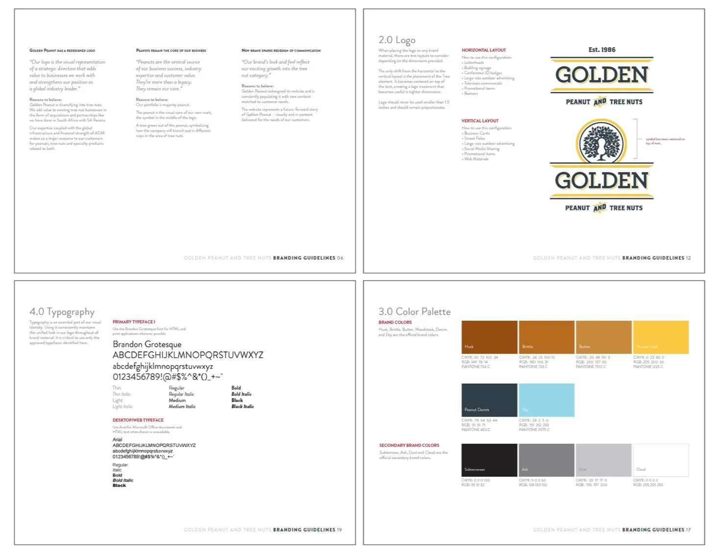
A fresh but traditional brand identity.
The mark would appear on storage silos in rural landscapes, farm signage, trucks and ships. At the heart is the peanut, clearly framed in the graphic design of a tree. A modern and almost whimsical illustrative device, flanked by traditional fonts and colors.
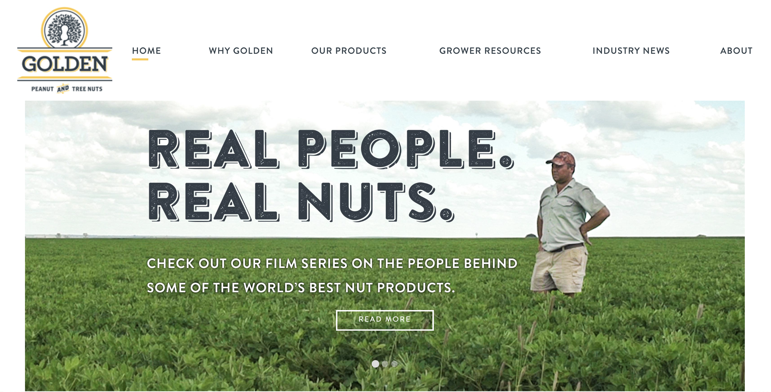
Our team designed and developed the new website showcasing the brand system, positioning and elevating the operation’s expansion into the tree nut market.